Avoid These 5 Casino Sign-Up Form Mistakes That Cost You NDPs
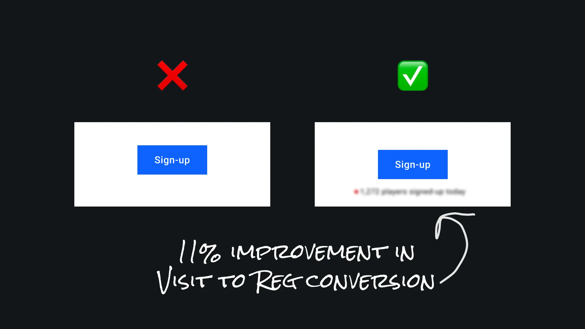
The sign-up flow – your golden gateway to new depositing players – is often riddled with mistakes that tank conversion rates. Don’t take my word for it: roughly 81% of users have abandoned an online form after starting to fill it out.source And one of the top reasons? You guessed it – overcomplicated or untrustworthy forms (27% quit because forms are too long, and 29% quit over privacy/security concerns).
In an age where you can one-click order a TV on Amazon or get a loan in 2 taps on Revolut, nobody has patience for a clunky 1998-style registration. If your sign-up form feels like an interrogation or a trap, players will nope out faster than you can say “bounce rate.”
Mistake 1: Asking for All the Info Upfront
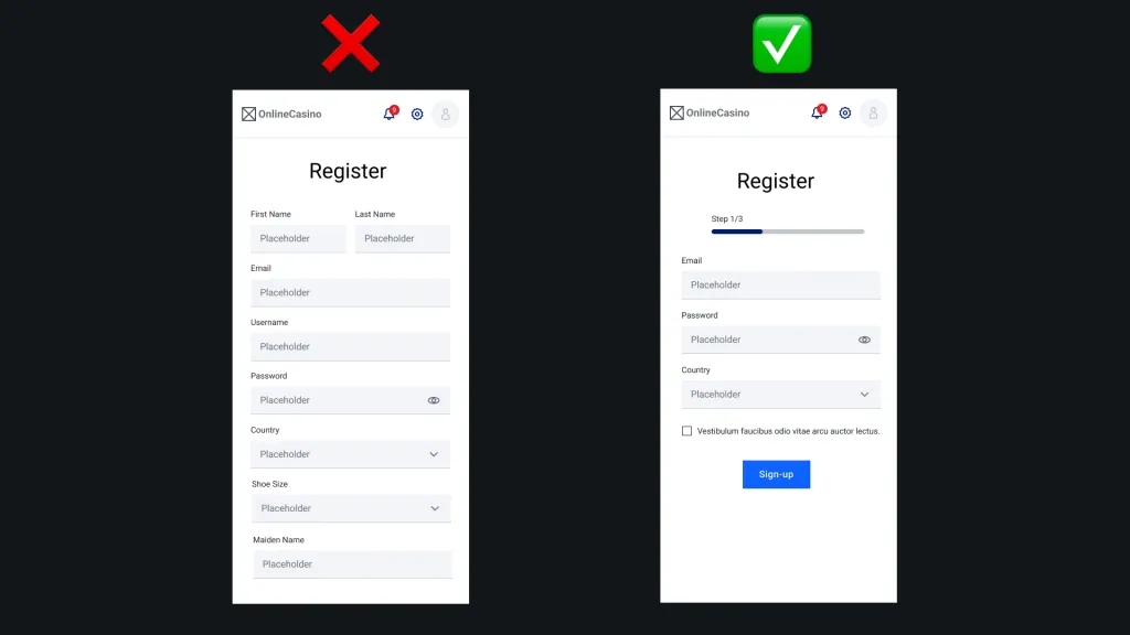
Does your casino’s registration form try to collect everything short of the user’s blood type and firstborn child on the very first step? If so, congratulations – you’re giving off serious 90s vibes (and not the good kind). Long forms are conversion killers. Every additional field you shove in a new user’s face is another reason for them to bail.
Think about it: users today expect minimal friction. They’re spoiled by apps and sites that let them get started with a social login or an email and password – boom, done. If they land on your sign-up page and see a 12-field monster form, their eyes glaze over. It screams “this is hard.” One UX study flat-out found that reducing the number of form fields improves UX and completion rates – it’s the # of fields, not the number of steps, that really matters.source In short, ask only for what you absolutely need to get them in the door. You can always collect additional info later once the user is engaged. As a bonus, fewer fields also means less chance for errors (and less to validate – see Mistake 4).
TL;DR: It’s not 1998 anymore – don’t start a relationship by bombarding newcomers with a data-harvesting marathon. Cut down those fields mercilessly. Your conversion rate will thank you, and so will your users’ sanity.
Mistake 2: Not Explaining Why You Need Sensitive Info
This is one of the most common issues I flag in conversion audits. The iGaming industry may be a merry bunch, but newsflash: players don’t trust online casinos an ounce by default. Can you blame them?
When a sketchy-looking casino site asks for personal details – date of birth, phone number, home address – a newbie’s mind races: “Are they going to steal my identity? Will I get spam calls from loan sharks?” It sounds extreme, but these are real thoughts. In fact, security and privacy fears deter ~29% of people from completing online forms.source
So what happens? Users either bounce or, if the field is required, they get sneaky. Baymard Institute observed users entering fake phone numbers (“9999999…”) just to get past a required phone field.source One test participant said outright: “I don’t want to be called by some sales dude... I’ve learned to type ‘9999’.”. Ouch. For the business, this is doubly bad: not only is the user annoyed, but the false info undermines your operations – e.g., fake numbers can cause verification or payment fails, leading the user to abandon the process later-on anyway.
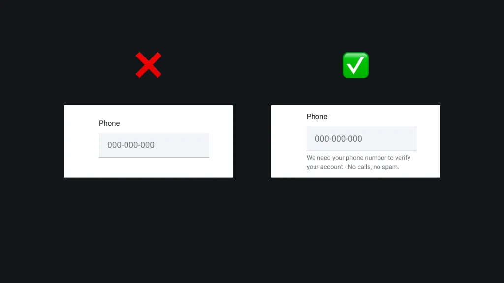
The fix is embarrassingly simple: explain why you need that info, at the moment you ask for it. A short note next to the field works wonders. Providing a brief inline explanation alleviates the vast majority of users’ privacy concerns*.* For example, if you ask for date of birth, add: “We need this to verify you’re of legal gambling age (think of it as keeping minors safe).” If you ask for a phone number: “Used only to verify your account – we will never call you for promos.” This kind of transparency builds trust.
Remember, users subscribe to a simple logic: if you already have one way to contact me (email), why do you need another (phone)? You have to answer that unspoken question. When sites did explain the reason, test users were much more forgiving and even complied without grumbling.source
TL;DR: Always answer the “Why do you need this??” before the user even has to wonder. Your sign-ups (and your phonebook of fake “999-999-9999” numbers) will greatly improve.
Mistake 3: Using Multi-Column Forms
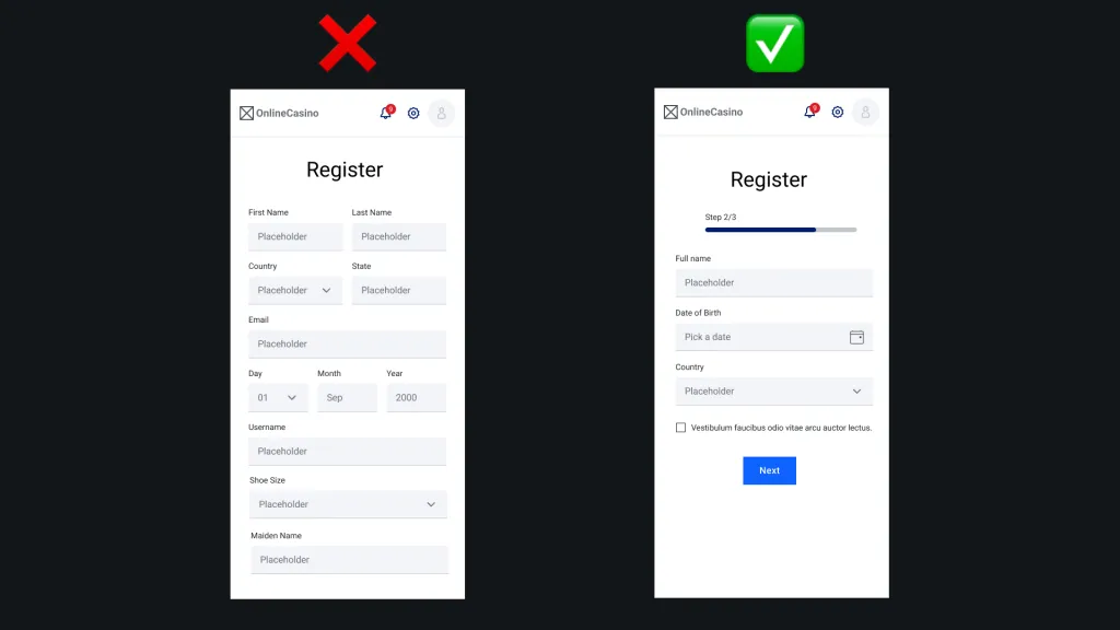
Ah, the two-column (or three-column!) form layout – a relic that refuses to die. Sure, it might look compact and organized to you. But to users, it’s often a usability hell. With mobile-first design being common sense now, you’d think multi-column forms would be extinct, yet I still stumble on registration pages splitting fields into two side-by-side columns. Why is this a problem? Because human eyes scan forms best in a single direction (down), not in zig-zags. When confronted with multiple columns, users get confused about where to go next – left column first? Or fill across the row? Multiple paths mean multiple chances to mess up.
The data is clear: multi-column forms increase error rates and frustration. Baymard Institute reports that about 16% of sites still use extensive multi-column forms – and they risk more checkout (or sign-up) abandonments due to preventable errors.source Users might skip a field they didn’t see, then get hit with an error message later – now they’re annoyed and have to hunt for the missed field. Or they might waste effort filling an optional field thinking it was required, because the layout didn’t make the distinction obvious. Either way, the experience is worse.
TL;DR: If you’ve got a registration form with first name on the left column and last name on the right, or address fields spread in two columns, do yourself a favor – stack them in one column. Yes, the page might be “longer,” but as UX research shows, perceived effort is lower when the form is linear. Don’t let a misguided desire to save screen space cost you real $$$ in lost sign-ups.
Mistake 4: No Inline Validation
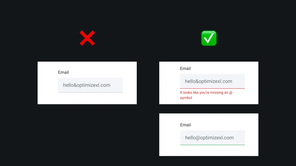
Few things are as infuriating online as painstakingly filling out a form, hitting Submit, and… “Please fix the errors highlighted below.”
Your flow is interrupted, and now you have to scroll back hunting for the one field you messed up. If your sign-up form only validates input after the user clicks submit – with no instant feedback as they type – you’re basically slapping your user in the face for doing what you asked. It’s a terrible first impression.
Research confirms this intuition. Baymard’s studies note that unexpected error messages at submission are jarring and frustrating, often causing users to abandon out of sheer irritation.source
The solution: live inline validation. As the user types or moves off a field, check their input and give immediate feedback. Is the email properly formatted? Did the password meet the criteria? Is the username available? Tell them in real time. This way, by the time they hit Submit, it’s already correct (or at least any remaining errors are minor).
A key detail: make the validation user-friendly. No one likes feeling policed. So, avoid premature or overzealous errors. Don’t flash a red “X” while I’m still typing my password just because it doesn’t have a number yet – that’s annoying (users hate the form “yelling” at them too soon).source Instead, wait until the field is out of focus or the entry is complete enough. Also, as soon as the input is corrected, remove the error message instantly – don’t leave a lingering “error” that’s actually fixed.
Here’s another pro tip: use positive inline validation too, not just negatives. Give a nice green checkmark or a success message when a field is correctly filled out. During testing, sites that showed a little checkmark (“✓”) next to valid inputs gave users a sense of accomplishment and progress as they went through the form.source It’s a subtle psychological win. It also reassures the more anxious users that “everything’s okay” with their input, so they don’t second-guess and re-read everything three times.
TL;DR: Inline validation turns form filling from a blind hike into a guided, interactive experience. You’re basically helping the user succeed in real-time.
Mistake 5: Overly Complex Password Requirements
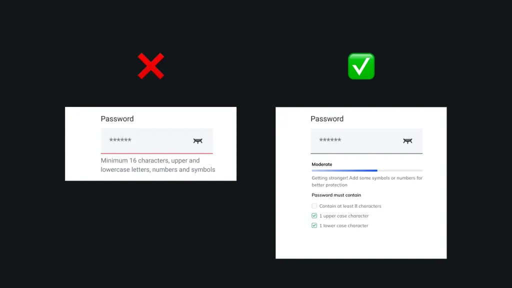
“Your password must be at least 20 characters, include uppercase, lowercase, a number, a hieroglyph and a haiku.” – If your password policy looks something like this, you might think you’re being super secure. In reality, you’re likely just driving users away or into bad habits. There’s a mountain of UX research on this: strict password rules hurt both conversion and security. And guess what – that correlates with fewer account sign-ups and more users locked out later.source
Users often can concoct a super-complicated password in the moment (maybe by adding “$%^” to their dog’s name or whatever), but remembering it later is a nightmare. Baymard’s studies observed frustrated users who, on return visits, failed to sign in because they couldn’t recall the weird password they made under duress.
So what’s the better approach? Make passwords reasonable and encourage better security through other means. Authentication UX best practice today is: require a minimum length (say 8 characters) – and that’s it for the mandatory part. No composition rules about symbols or caps, which research shows have diminishing returns if the password is long enough. NIST (the National Institute of Standards and Technology) actually recommends a minimum of 8 chars (or even 6 if the password is randomly generated), and no arbitrary max length (let people use 20+ if they want). This balances security with usability. You can suggest a stronger password (many sites now have a strength meter or say “Consider adding a symbol or using 12+ characters”), but let the user proceed with simple password if they want. They’ll be more likely to remember it, and thus stay logged in and active.
Crucially, offer and encourage Two-Factor Authentication (2FA) as a follow-up instead of front-loading password pain. In the online gambling space, 2FA is a far more effective security booster than forcing an excruciating password.
Lastly, if you do have any password rules at all, communicate them clearly and use inline validation for each criterion (see Mistake 4). Don’t make someone attempt a password and get a generic “does not meet requirements” after submission. If you require a number, show a checklist that ticks off “✓ Contains a number” as they type. This way the user sees progress (“3 of 5 requirements met”) instead of banging their head against the wall figuring out what’s missing. Transparency here again is key to reducing frustration.
TL;DR: An overly complex password policy is a self-inflicted wound. You might think you’re preventing fraud, but you’re likely just preventing conversions (and encouraging risky behavior). Keep it simple, and lean on modern security measures like 2FA to do the heavy lifting.
You've Avoided the Mistakes - Now Motivate Your Users
So those are the five cardinal sins of casino sign-up flows. Avoiding them will remove a lot of friction and stop losing sign-ups you could have won. But avoiding mistakes is only half the battle – what if you want to actively boost your conversion rate?
The best registration flows not only refrain from frustrating users, they also motivate and excite users to complete the process. In the competitive gambling market, you need every edge to turn a curious visitor into a committed player with a funded account.
This is where a bit of psychology and clever UX can give you a serious lift. Let’s explore three of my favorite motivational levers that can skyrocket your visit-to-registration conversion, and even prime users to make a hefty first deposit.
Motivational Lever 1: The Endowment Effect
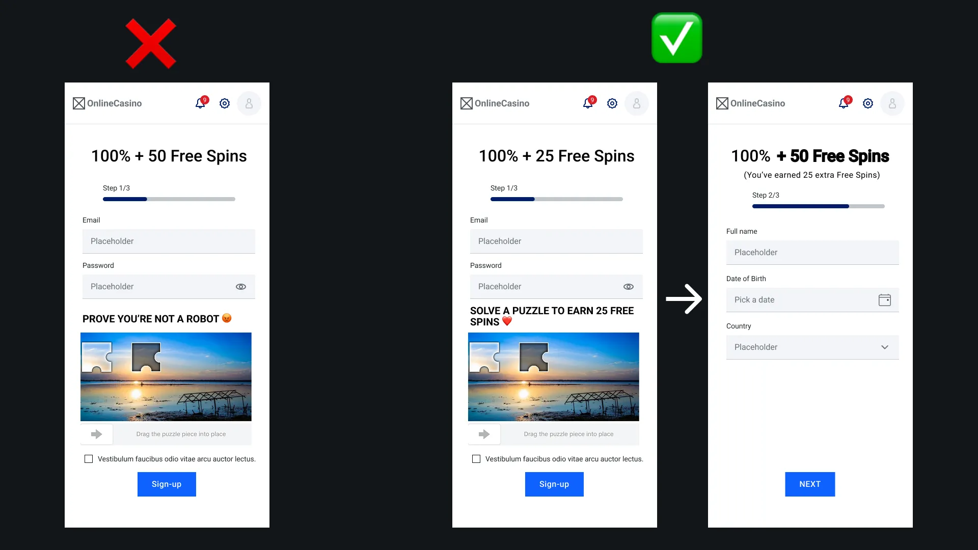
People value something more once they feel it’s theirs. This is the Endowment Effect, a well-documented cognitive bias. It’s not just pop-psychology jargon – folks literally put more money on the line for items they own. Classic experiments by Kahneman and Thaler found that if you give someone a coffee mug, they then demand roughly twice as much money to part with it than what others were willing to pay to get it. In another study, holders of tournament tickets valued them 14 times higher than non-holders did. In plain terms, ownership creates attachment – even if that ownership only lasted a few minutes and was completely random!
So how do we leverage this in a casino sign-up? Start by giving the user a small “gift” or bonus right at registration. If users feel they already own something of value in your casino, they’re more likely to finish signing up and stick around (because now they have something to lose if they leave). The trick is to make the gift feel real and tangible, not just a marketing gimmick. One effective approach is to make the user earn the reward through a bit of effort, thereby increasing the endowment effect. Psych research shows the more effort we put into something, the more we value it – related to the “IKEA effect” (people love furniture they built themselves). In the context of sign-up, this could mean: “Complete your profile info to unlock 20 free spins” or “Solve this fun puzzle to get a $5 bonus chip.” By doing a tiny task, the user feels like they earned the reward, which strengthens their attachment to it.
Some ideas that iGaming brands have tried:
- Tiered welcome gifts: e.g. “Fill in just your email and get 10 free spins now, plus another 10 spins after you verify your phone.” The user gets an immediate taste of ownership (10 spins in their account), and an incentive to complete the next step for more.
- Mini-games or quizzes during sign-up: Perhaps after the basic details, you show a quick “Spin the Wheel” game where everyone wins something (could be a small bonus, or entries to a newbie raffle, etc.). Now the user has “winnings” tied to their account – they won’t want to abandon the form because that value would vanish. (This taps into endowment and a bit of loss aversion.)
- Progressive VIP or collectibles: For instance, “You just earned your first badge in our VIP program for registering! Collect 5 badges in your first week to get a $50 bonus.” Now the user has a sense of progress and ownership in a meta-game, not just an empty new account.
The key is to make the user feel like “this is mine now.” Even a trivial reward can trigger the endowment effect if presented earnestly. And yes, it has to feel genuine – if it’s obviously a ploy, users may not bite. But done right, it’s powerful. In fact, one study on form completion found that 30% of people will return to finish a form if it offers a free incentive they value. That’s huge! Imagine recapturing 30% of would-be abandons just by dangling a small carrot. We are simple creatures.
Bottom line: Front-load a bit of value to the user. Give them a sense of ownership early – a bonus, exclusive token, lottery ticket whatever fits your product. Once they have it in their grubby virtual hands, they’re psychologically invested. It flips the script from “the casino wants my info” to “I want what the casino is giving me.” And that, my friends, is how you turn the tables in the conversion game.
I'm already giving away free spins in my welcome offer, is that enough? If the 'gift' is part of the default offer it will most likely not trigger the endowment effect. Making the gift feel genuine is key here. I find that key factors here are: A) making the user work for the reward B) making the user feel like they can easily lose the reward C) Rewarding the item unexpectedly in real-time
Motivational Lever 2: Scarcity & Loss Aversion
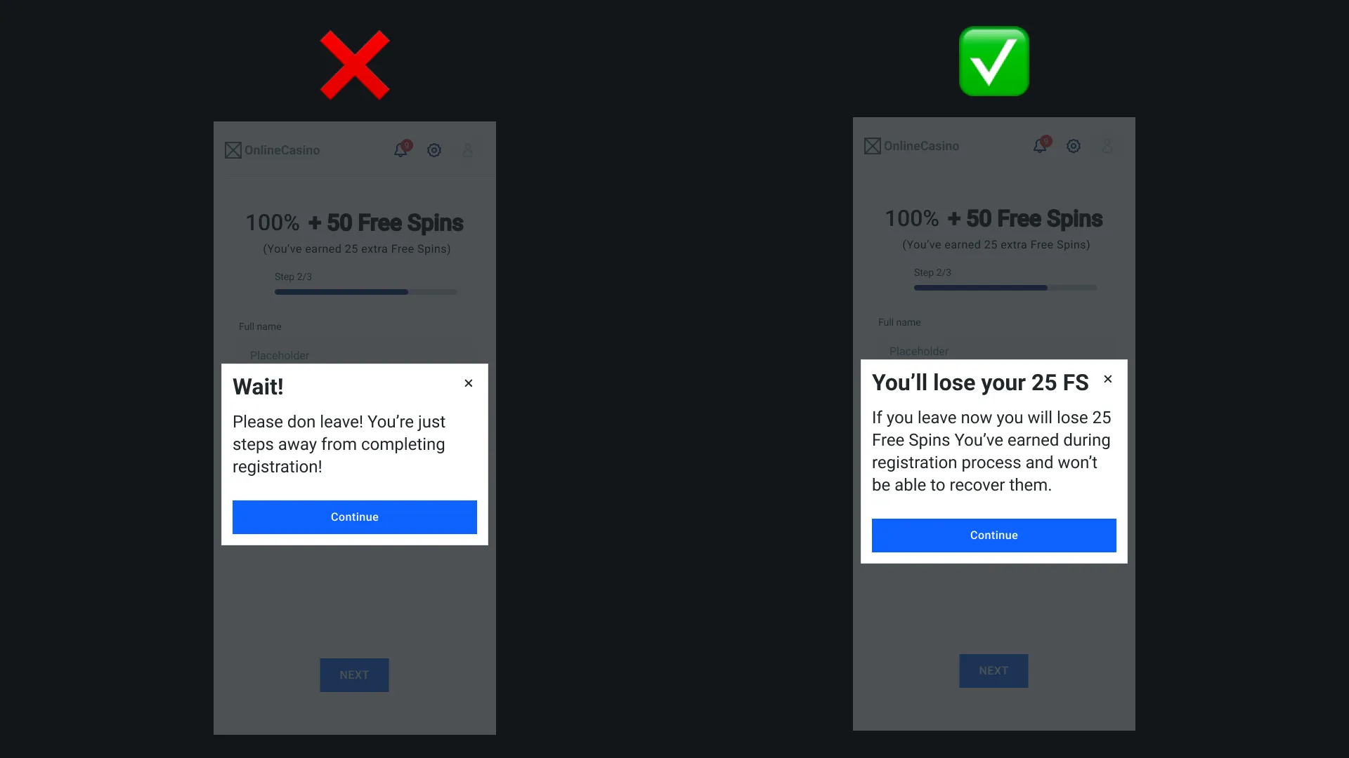
In the wider world of e-commerce and marketing, scarcity is the classic conversion booster. Limited-time offer, limited quantity, countdown timers – you’ve seen it everywhere because it flat out works.
The psychology is straightforward: when something seems scarce or fleeting, we instinctively desire it more. It triggers FOMO – Fear of Missing Out – an almost primal anxiety that we’ll lose an opportunity if we don’t act. Behavioral studies show that perceived scarcity significantly increases purchase intention, especially for people prone to needing unique or exclusive things. And nearly 45% of shoppers admit FOMO has influenced them into an impulse purchase. That’s almost half your audience who can be swayed by a ticking clock or a “only 3 left!” note. Marketers have even measured ridiculous uplifts: one case found that an “Only X left in stock” message boosted sales by up to 226%. No, that’s not a typo – scarcity can more than triple conversions when done right.
Surprisingly, online gambling sites underutilize this tactic. Sure, some have countdowns for bonus offers or limited-time tournaments, but we could push it further in the sign-up and early deposit phase. How to use scarcity for casino sign-ups? A few ideas:
- Time-limited Welcome Bonus: Instead of a generic “Welcome bonus up to $500,” add urgency: “$500 Welcome Bonus – only for sign-ups this week” or even more granular, “Sign up in the next 24 hours to get an extra 100 free spins.” The user feels pressure to not procrastinate. (Pro tip: You can actually show a countdown timer on the registration page: “Offer expires in 10:00 minutes” – just be sure to actually honor it or at least refresh it for new visitors; false scarcity if discovered can backfire.)
- Limited Quantity Freebies: For example, “First 100 new players today get a free entry into the $10k raffle.” If I’m player number 101… well, I better hurry and hope I’m in the first 100. Tiered scarcity works nicely: show the ones that already expired (“100 free spins giveaway – Expired”) and the current one (“Today only: 90 free spins for new sign-ups”). This not only creates urgency but provides social proof that offers do get taken (people did claim yesterday’s, see, it’s gone).
- Exclusive Early-Bird Access: Like “Sign up now to join our upcoming high-roller tournament – only 50 seats for new members!” Even if a user isn’t a high roller, exclusivity is alluring. Scarcity isn’t just about time, it can be about availability and exclusivity too (only so many slots, only so many bonuses).
One thing: scarcity should come with credibility. If everything on your site has a countdown or every user gets told “only 1 bonus left!”, people smell BS. Gambling users are already wary, so be strategic and truthful with this lever. Perhaps show real stats: “Only 5 of 50 New Year promo codes remaining” and update it as they get claimed. That both builds urgency and trust (because you’re transparently showing the counter tick down).
When implemented sincerely, scarcity taps into that fast, emotion-driven decision mode (what psychologists call “System 1 thinking”). It basically shouts at the lizard brain, “Act now or you’ll lose out!” In the context of sign-up, this can bump a hesitant user over the edge to do it now instead of “maybe later.” We’ve all seen how effective this is in other industries (flash sales, hotel booking sites, etc.), so there’s no reason not to apply it in iGaming.
Motivational Lever 3: Social Proof
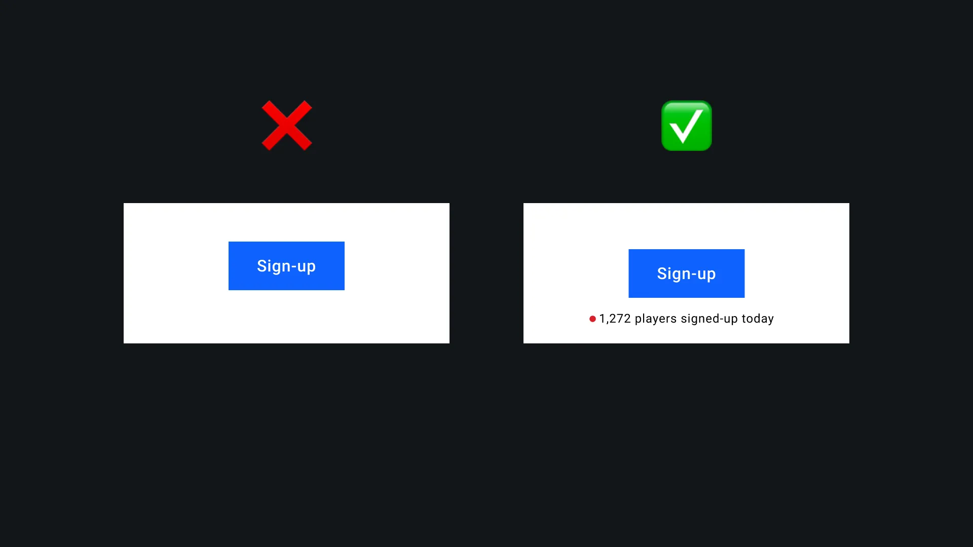
Humans are social creatures. When uncertain, we look to what others are doing to guide our own actions – a phenomenon Cialdini famously documented and dubbed Social Proof In online gambling, trust is the make-or-break factor for new players (a 2013 study showed that consumers’ trust heavily influences their intention to gamble and loyalty to a site). One of the fastest ways to build that trust is to show the user that other people just like them are not only signing up, but winning and enjoying the site. The implicit message is, “You’re not going to get scammed or regret this – look, others are having a good experience here.”
Many casino sites have started using “Latest winners” tickers or live feed of recent activity. That’s a good start, but it’s often tucked in a corner or only on the homepage. Why not integrate social proof directly into the sign-up flow where anxiety is highest? For example:
- Before user hits the registration page, display a little feed: “John from Texas just signed up 2 minutes ago and scored a $10 bonus!” or “Lucy just won $50 on Mega Slots!” This creates excitement and reassurance at the point of decision. It says “Join the party, it’s lively!” It’s the online equivalent of walking into a buzzing casino floor versus an empty room.
- Before the deposit process (the next critical conversion point), show: “50 players deposited in the last hour. Join them and double your deposit with our bonus.” Or highlight a big recent win: “Mike just hit a $1,000 jackpot on Blackjack!” which nudges the user thinking, hey that could be me if I play (but they need to deposit first).
- Community indicators: “Over 20,000 players have joined this month!” or a live online count “1,245 players online now”. This taps into herd mentality in a positive way – nobody wants to be the only sucker in a new place. If thousands are playing (and winning) here, it must be legit.
Social proof can take many forms – reviews, ratings, testimonials – but in gambling, real-time proof seems especially potent. It injects energy and credibility. In fact, studies in consumer psychology show people are “far more likely to trust and act when they see others doing the same.” It’s one thing for you to boast “we’re great, trust us”; it’s far more persuasive to show evidence that “these players trusted us and it paid off.” Even something as simple as a scrolling list of recent winners (with maybe the game or amount won) can increase a new user’s confidence that A) the casino actually pays out, and B) people do win, so maybe they can too. It’s part trust signal, part aspiration trigger.
One caution: authenticity. Gamblers are a skeptical bunch. If your “latest winners” looks fake or loops names (“Andy won $5, Bob won $7…”) in too neat of an interval, it could backfire. Use actual data if possible, or at least make it varied and realistic. And ensure the wins shown are frequent but mostly small/medium; a constant feed of huge wins might oddly discourage new players (“I’ll never get that lucky”). Showing $5, $20, $50 wins with the occasional big one keeps it relatable.
Also, leverage community if you have it. For instance, if your site has a chat or a forum, highlighting an active friendly community (like “Chat now: 200 players online discussing strategies”) can give a newcomer the sense that this is a social, safe environment.
The bottom line on social proof: People trust people. If you can show that others are signing up, depositing, and winning right now on your platform, a newbie is far more likely to jump in. It mitigates the fear of the unknown – they feel like they’re joining a crowd, not venturing alone. Social proof is essentially herd mentality, and as much as we like to think we’re rational independent beings, in risky situations (like putting money into a new casino site) we often find safety in numbers. So put those numbers (and names and wins) front and center!